
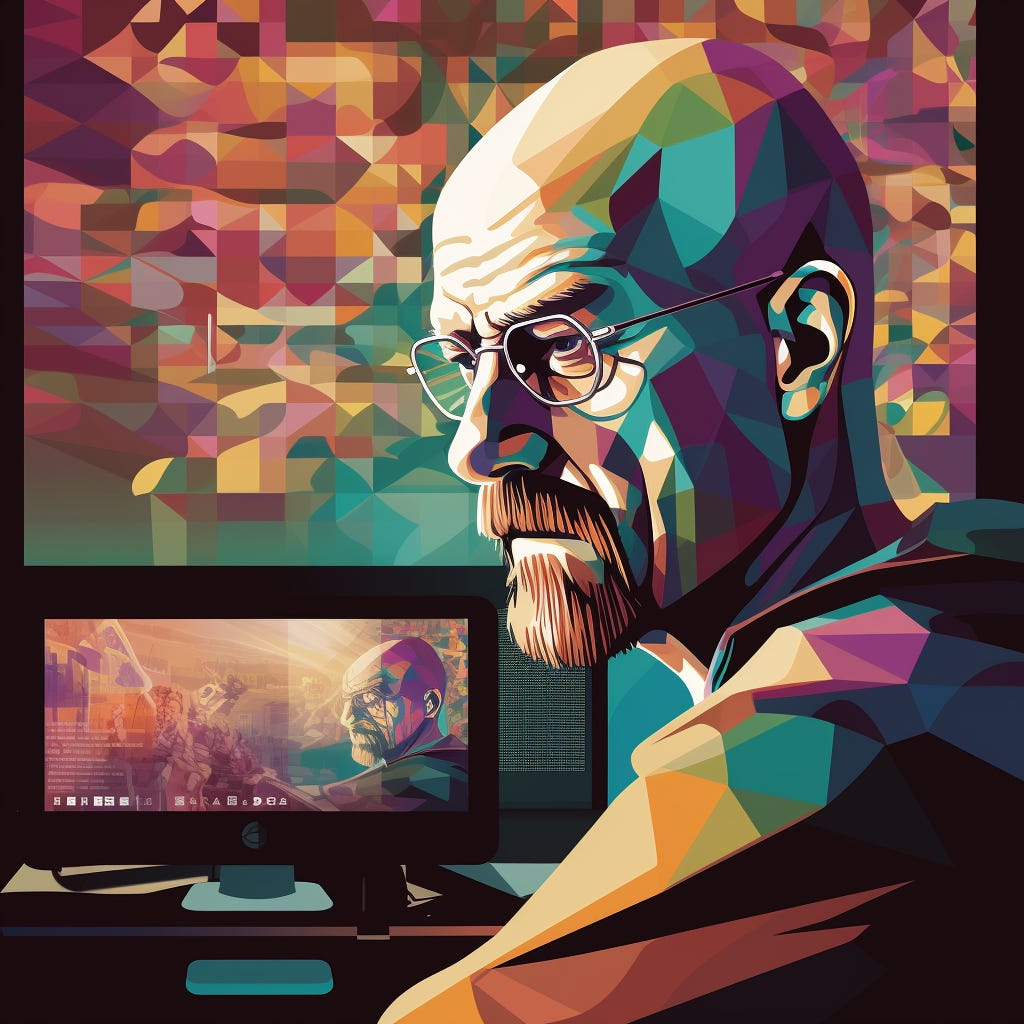
Breaking Bad UX: Dark Patterns & the Art of Deception
Dark Patterns be like "I'm the one who knocks."

Welcome to the FLUX Yeah! newsletter! In it, I share practices and processes of designing products, explore the connection between humans and technology, experiment with tools, styles and services, share insights on personal and professional growth, & highlight members of the FLUX Yeah! community. The goal is always to make space for diverse perspectives and new voices, so if you have an idea, feel free to reach out. ❤️, Sarah
Some backstory for today’s topic
I was workshopping the settings screen of an app with a UX designer. She asks “Would you like to allow users to delete their profile?” 👀
If theres one thing I love to hate in product design, it’s trickery. Making it unclear or even impossible for a user to remove their account keeps the user in the short term- but will break trust and hurt the brand in the longer term.
The question was the start of a great conversation about dark vs light UX patterns as we designed a very clear ‘Delete Account’ functionality. And it inspired today’s Newsletter 😆
In today’s newsletter
🔦 Deception though dark patterns
💬 Slack Happenings
🔦 Deception through Dark Patterns
Imagine this: you're happily browsing a site, and suddenly, you're subscribed to a newsletter you don't remember opting into and purchased travel insurance with your plane ticket 😣. Welcome to the world of dark patterns in UX design. These tactics can make your online experience feel like a dark and dead-end alley.
Some classic dark pattern moves:
1. Confirmshaming
Confirmshaming works by triggering feelings of guilt or shame to influence users choice. This one shows up a lot during opt-out interactions. Maybe you’re trying to end your fitness app subscription but you have to click some demeaning button to do so: “I don’t care about my health” or “I prefer to be a slug.” 🐌
Some of these can be mild and use humor. But by honing in on users' emotional states and their perceptions of themselves, the intent of confirmshaming is to stop users from going through with that opt out.
Here are some examples:
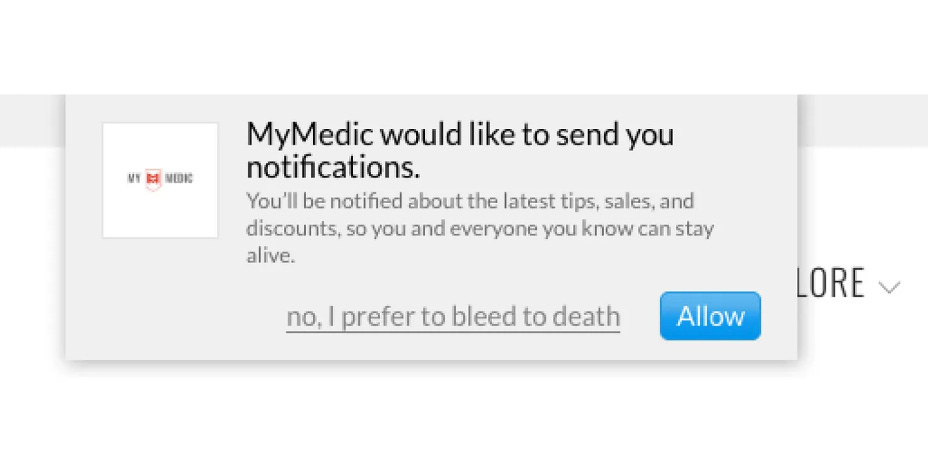
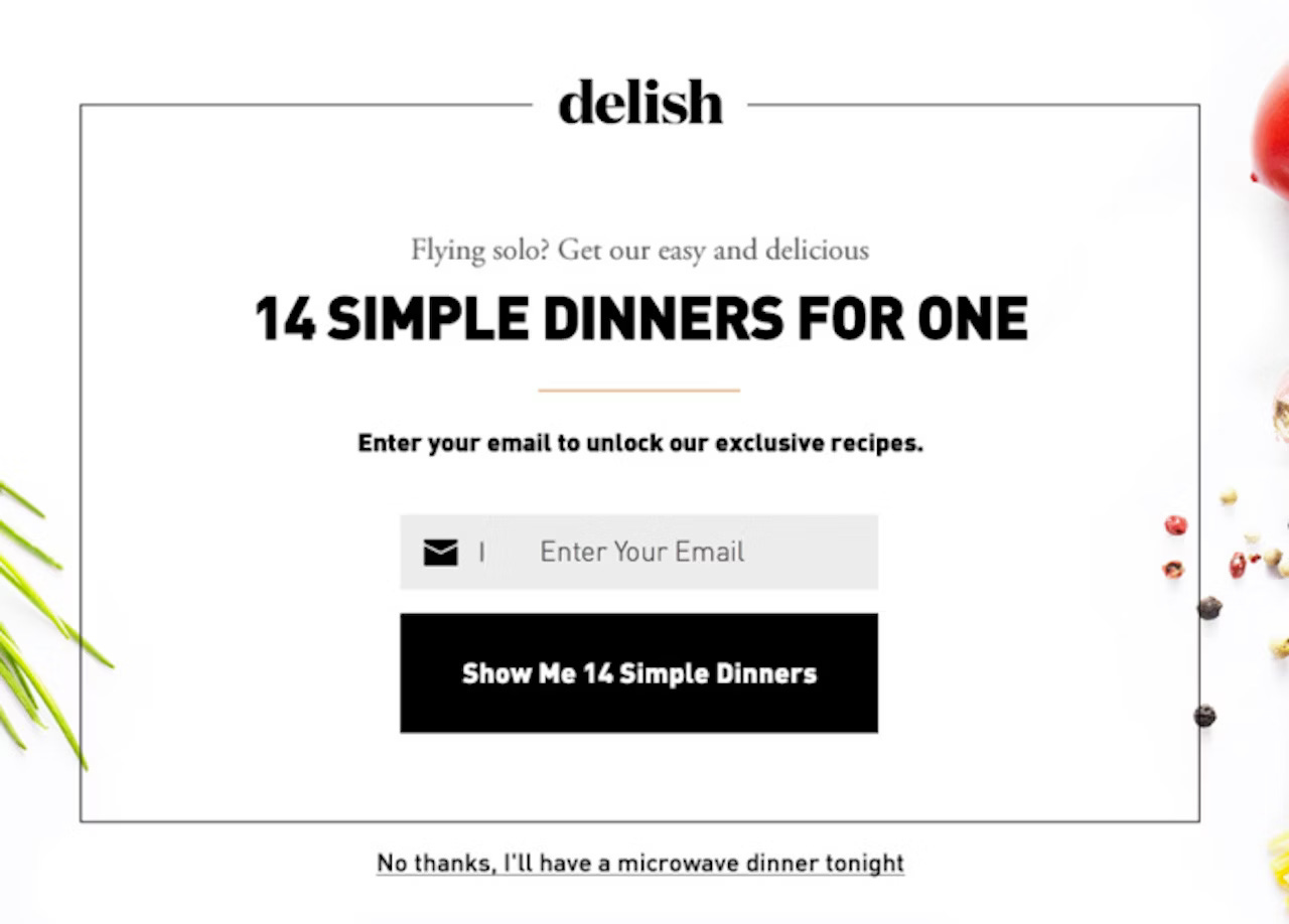
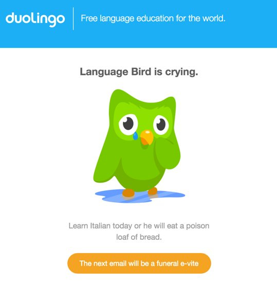
*Rate these examples from least to most Audacity in the comments.*
2. Roach hotel 🪳
🪳A roach motel pattern is called such because the design makes it very easy for you to get into but difficult to get out of. 🪳🪳🪳
If you were emailed this newsletter, you’ll see a very clear “Unsubscribe” at the end of the email. And as much as I love having you here, allowing you agency to make that decision on your own ranks higher. 🪳
Editors Note: This section gave me the ick.
3. Nagging
Not now. Not Now. Not Now!
Nagging is a dark pattern in which users are repeatedly asked the same thing. Generally, there is no option to make it stop so you have to choose “Not Now” until you break down and comply.
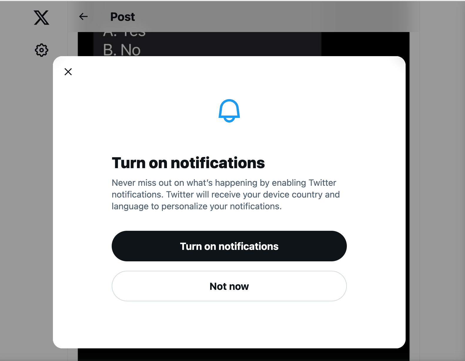
Hard to believe, but as I was searching for a good visual example of this, I got this popup. Thanks for making my job easy, X.
Final thought: Be the light! 💡
How can you be the light in this dark and seedy world I just told you about?
The first step is to gain knowledge on these practices. Harry Brignull coined the term “dark patterns” in 2010 and has been keeping tabs on them ever since. His site deceptive.design, provides definitions, examples, and a running of any laws being put into place.
➡️ Make it a mission to never end up in his “Hall of Shame.”
A good rule of thumb?
Don’t just avoid using dark patterns — but proactively create light patterns. Those that are transparent, fair, and respectful of the user's rights and autonomy.
By embracing ethical UX design, we're creating a web where trust flourishes and everyone enjoys a smoother online experience. Stay curious, stay aware, and keep exploring! 🌟
Want to learn more about Dark Patterns or Light Patterns? Let me know in the comments!
💬 Slack Happenings: Slackenings?
This week on the Fluxyeah Slack, the community shared some really amazing events, open jobs, contests and case studies.
In case you missed it:
Andrew Schall promoted this great opportunity: the UXPA "Designing the User Experience" Poster Contest! details here.
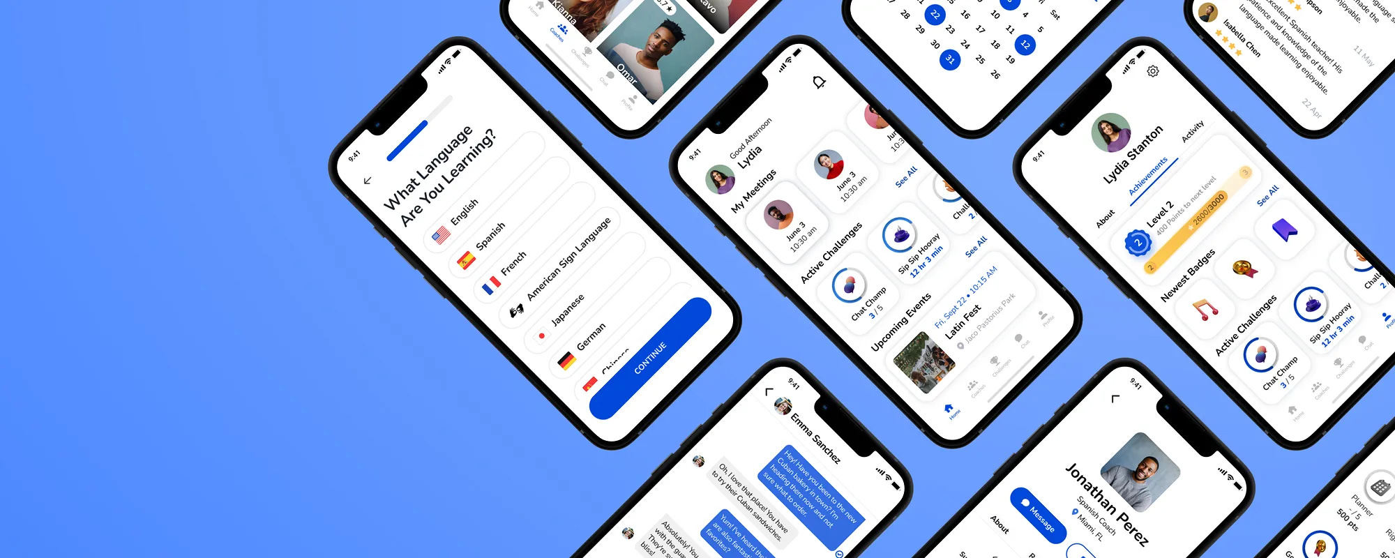
P.S. if you’re interested in Experience design and healthcare, he is someone you’ll want to follow!Lauren Fuentes, brand new to UX, shared her case study on a Language Immersion App. I had the privilege of seeing this one come to life. Find it here and give Lauren some support and feedback! Sneak peak 👇

In case you missed the subtitle reference…


Thank for reading! And if someone you know would benefit from this newsletter or community, please invite them!
Great post Sarah! Thank you for sharing.
My ordering would be Delish, DuoLingo and MyMedic (😲). haha
DuoLingo toned it down after they went public, but it still retains a little bit of an edge that I enjoy.
I think nagging patterns are bad, but equally bad is relegating an important setting to a menu that is buried multiple levels down and only giving the option to elect at signup. This is especially annoying, if it is something controlled at the system level or by the OS, as is the case with notifications on iOS.
Haha kudos on the word play. Heisenberg would be proud. 🙂